|
JERGENS
Vision 2007
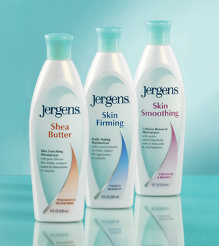
Jergens had a total brand
redesign including bottle
and logo in 2006. It was a
dramatic change with only
typeface and coloration any
reference to what was on
shelf for years. The bottle
is beautiful. I think the label
is dated. The shapes, fonts
and gradations feel very
80s. I do like the sense of
being enveloped. Also, no
imagery, so prevalent in the
category, makes it feel old.
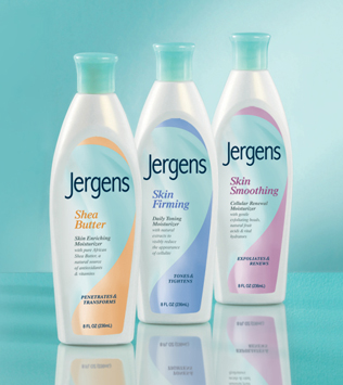
Now the variant color wraps
subtle imagery. Greater
contrast between a
familiar
looking logo and the variant
name, in size and style,
strengthens the new logo.
|