|
BIORÉ
Vision 2007
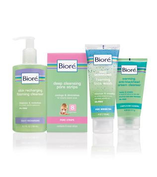
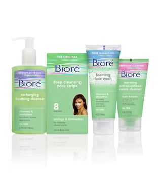
The packaging architecture
I designed for line extensions
became the brand standard.
The ribbon became less
prominent but was always
an awkward branding
element especially in print
and POP display. The logo
lost its tag line and got more
room to breath in its box
but it feels generic — more
like a store brand than a
Brand Name.
I think the best equity is
the color story. I’ve
paired Bioré green with
the same ribbon colors
in a new fluid, fun way
to feel fresh and modern.
|